


Fruit Smash
Making a Hard Seltzer that Stands Out
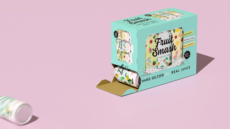
This is a project I was involved in during my time at Enlisted Design. I was not the main designer, but my role did include exploration of secondary typefaces, can layout, background colors, packaging design for boxed sets, and production work.
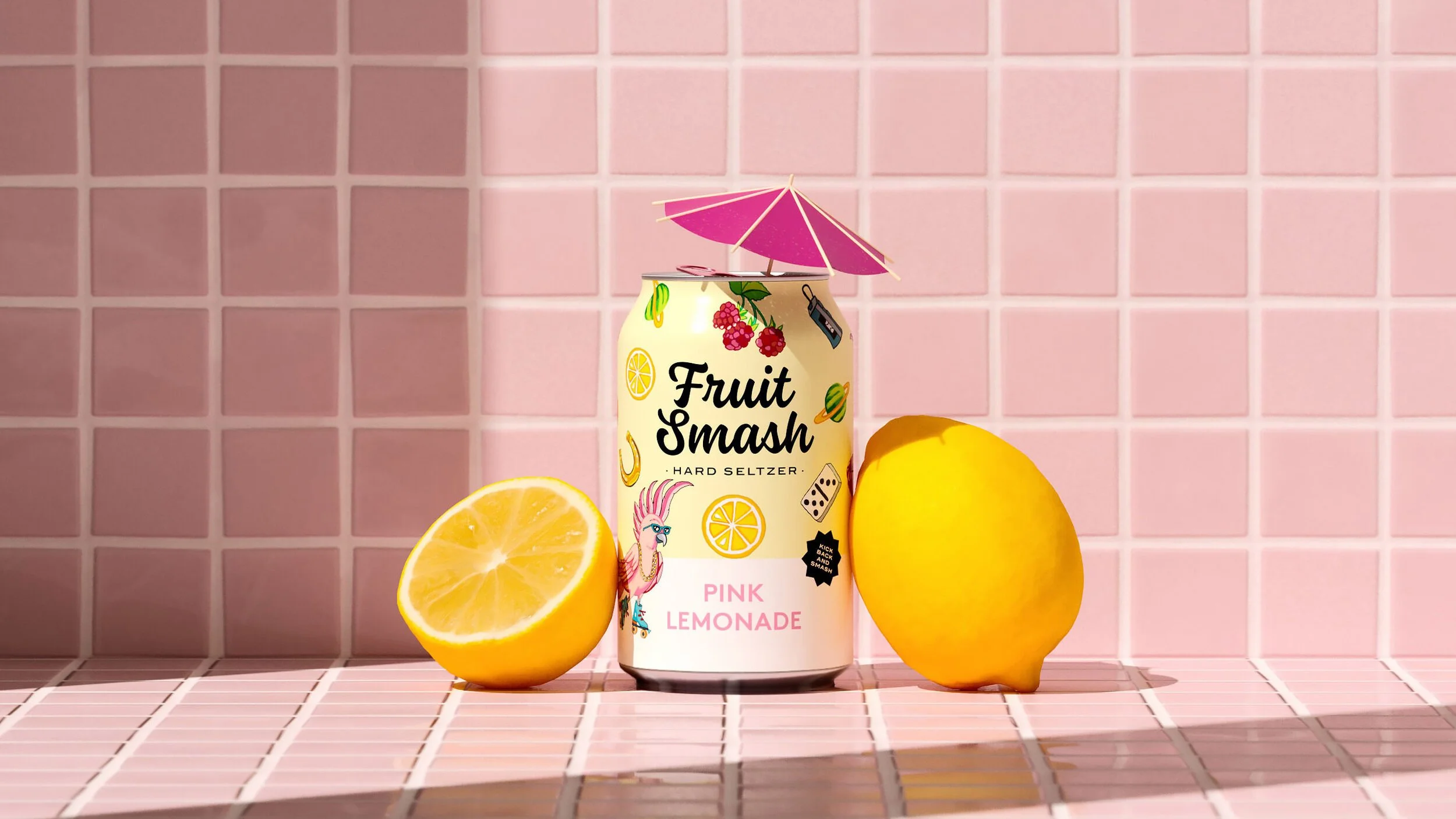
The goal was to create a hard seltzer for New Belgium Brewing that would stand out from the sleek black-and-white designs of competitors like White Claw and Truly. The illustrations featured on the cans were drawn by a tattoo artist.