

Logan Country Club
Bringing a site from generic and clunky to tidy and intuitive
Before, the Logan Country Club had a wonky site. Buttons and ux elements were unclear and made it difficult to understand where you were navigating to on the website, and the whole topic of golf was neglected in content and space. The home page was redundant, repeating the same information shown elsewhere on the site (and not in overly helpful ways.) Buttons linked to the same pages over and again, and in general, the site did not reflect the high-end experience members have in-person at the club.
To move forward and create an experience reflective of the beauty, relaxation, and tradition felt at the Logan Country Club, I simplified the site as much as possible and created opportunities to insert new content that would support the brand’s mission to celebrate heritage, elegance, and community.
Below: Screen recording of the country club’s website before redesign.
Site Audit
Overall, the site felt very generic with nonstandard navigation and site structure, which felt confusing rather than helpful. The main navigation buttons floated to the top of the page upon scrolling, but if you actually were at the top of the site, they were below the top hero image and sat close to the bottom of the page. Additionally, the hero image on the the homepage is split between golf and events, when in reality, the country club does most of its business around golf, and events are just a small part of the organization. Knowing this, I moved forward with golf at the center of the new website.
Reevaluating Site Structure for Clarity
To remedy the issue with the site navigation, I moved the central navigation to the top of the page, with a second tier shown as needed (only on the “golf” page.) To the right is a video showing the interaction with the top nav, showing the hover state and then the active state of the text buttons.
I also renamed the different areas for clarity and ordered them left-to-right in descending order of importance.

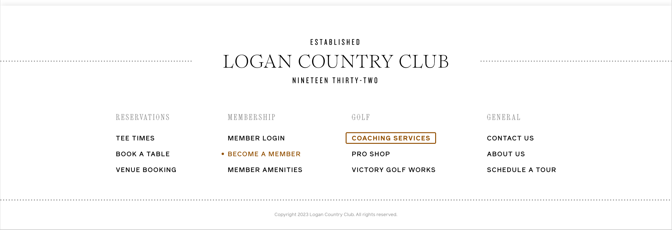
Adding Footer Navigation with Easy Actions
Shown to the left, top to bottom, are the old website footer and the redesigned website footer.
In the old version, the navigation buttons are the same as the top navigation, which isn’t super helpful with the top navigation always visible anyways. Additionally, the green active color (seen on “GOLF” and “JOIN”) is very low contrast against the navy background, which causes issues of legibility and accessibility.
The redesigned version has quick links organized into four columns. These are buttons that include quick actions that may trigger a user to visit the site in the first place, and if they scroll through a page and don’t immediately see a clear path to one of these actions, then they can execute any of these items from the footer.
“Become a Member” showcases the hover style, and “coaching services” the active state, which only stays visible momentarily as the browser loads the new page. Unlike the original iteration, these buttons are distinguished by text style and shape in addition to color, and are easily readable with high-contrast to the background, which makes them accessibility-friendly.
Landing Page: Refocusing on Tradition, Family, and Community
Following discussion with the client, one of the brand values he wanted to highlight in the redesign was tradition. We looked at several sites that told the story of tradition in their establishments, and we decided to create a timeline on the landing page that would highlight significant events in the history of the Logan Country Club, featuring many authentic photos at the club dating back 90 years.
In order to showcase community, I added a module near the top of the page to highlight the organization’s longstanding impact on the community. Further, there is a module near the bottom of the page that has club members’ positive words about the club.
The golf & amenities module gives a short preview of the services available at the Logan Country Club without being redundant to the rest of the site.


Golf Page: Competitor Analysis and Strategy
I took time to survey sites for several other golf courses either similar in demographic (high-end/exclusive) or location (local to Utah.) I wanted to see what they included, how they displayed information, and etc. This was especially important on the areas of the sites that showcased the golf courses.
To the right are some examples of sites that had generally interesting user experience design showcasing their golf courses. However, I didn’t think any of them were ideal, and all had room for improvement. I did take inspiration from some of them and brought that to the Logan Country Club site, whose golf-centric page didn’t have descriptions or photos of the different holes. It essentially just had a description paragraph, information about different tiers of membership, and a contact form.


When navigating to the golf page, the first thing you see is the course guide and interactive map. This is what it looks like without interaction.
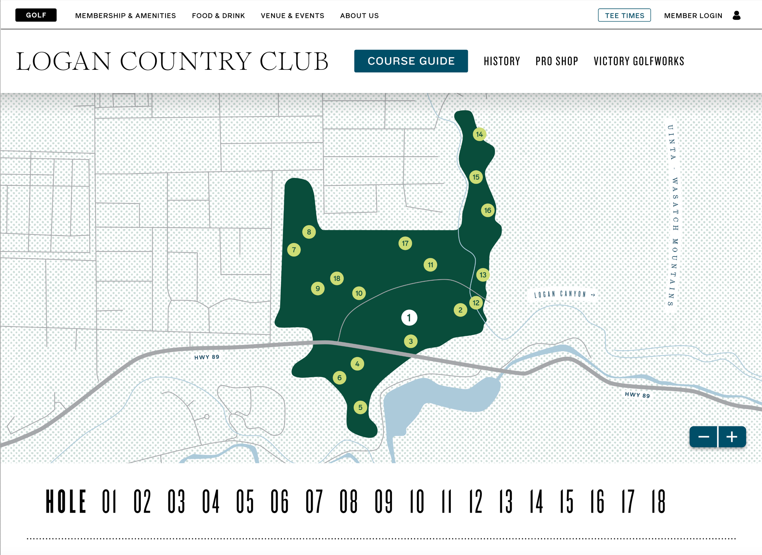
If you hover a hole on the map, the number and container circle enlarge a bit and change to white.

Once clicked, the map will zoom in slightly towards the active hole, which resumes its normal size but remains white, with an added line around the circle. Users can navigate by clicking and dragging on the map with their cursor and by using the zoom controls in the corner.
Golf Page Run-Through
As seen above, the golf page was finalized. The secondary navigation, adjacent to the
Logan Country Club wordmark, scrolls to the relevant section of the page rather than opening new pages. I made this decision because each area had very limited information to display, and creating new pages for sometimes less than a paragraph of text felt superfluous and unnecessarily complicated.
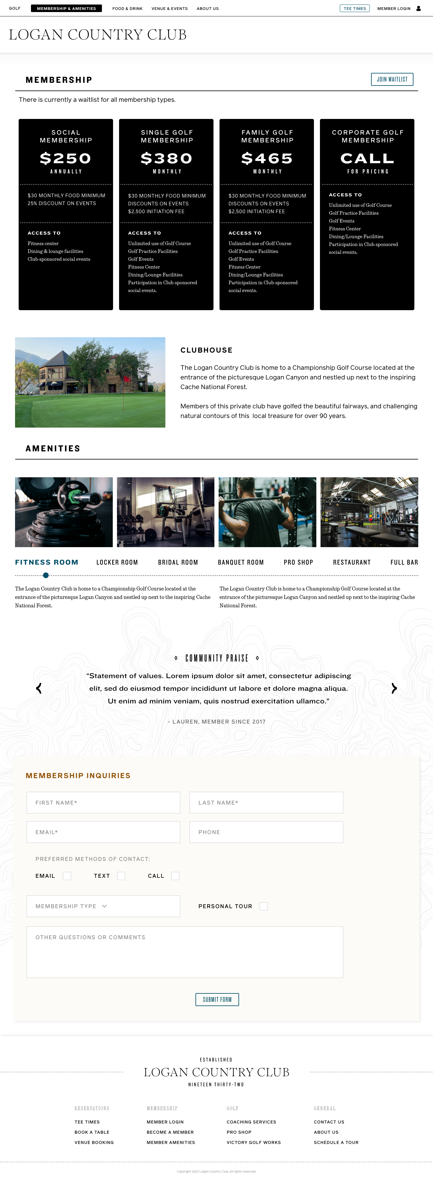
Membership & Amenities
The membership and amenities page prioritizes the membership plan information, followed by the amenities. The user can click the title of each amenity and see photos related to that item. The text also repopulates based on the active selection.
I also thought it would be appropriate to include quotes and praise from current members on this page to add credibility.
Finally, there is a form potential members can fill out if they’d like more information. While this is meant to be a flattering page, the Logan Country Club does not need more members and is operating on a waitlist, so there is no need to include several CTAs or pleaing pitches for new members.

Food & Drink
While the client wanted separate branding for the bar versus the restaurant, since both fit in the category of “food and drink,” I thought it most logical and convenient to house them on the same page.
On this page, the “Logan Country Club” wordmark is swapped for “The Canyon.”
The page defaults to the dinner menu, as that is most frequently what brings people to the restaurant. However, users can easily toggle to the lunch menu, drinks menu, or event catering page from there. “Reserve a table” at this point will navigate to a third-party page for booking, so there is no page design for that.
The menu here mimics the print version in many ways, showcasing the brand typography and placed atop a large-scale bitmap photograph.
The page finishes with a blurb about Chef Hamilton, the mastermind behind the restaurant.
I have not shown the lunch or drinks pages here as they are designed in the same format as the dinner page.
For events, I’ve included space for photos of the catering and a short description area to shed more light on the catering situation.
More importantly, there is a form for catering inquiries that asks for enough information for The Canyon to respond with availability and pricing estimates.


Venue & Events
The venue and events page has a small intro with information relevant to any and all of the venue spaces.
The bulk of the page is occupied by particulars of each individual venue space. This includes a photo, a small icon indicating whether it’s an indoor or outdoor venue, the space title, a short blurb, details concerning what is included, the price, and time frame available. Where applicable, capacity is also indicated.
Similar to the catering page, there is a thorough intake form for users interested in inquiring about a venue.

About Us
Since the history of the Club is emphasized elsewhere, the About Us page is quite simple, featuring a photo of the Club’s iconic tree, a short few paragraphs about the Club, and images and titles for the ownership and management team.