
ScripturePlus
UI Overhaul and Adding Small UX Tweaks
ScripturePlus is Scripture Central’s app to read and study the scriptures. Like all of the other brand subsidiaries prior to my work, it would be nigh impossible to know that this app was at all related to any of its brand siblings (Bible Central, Book of Mormon Central, etc.) While I’ll admit I disagree with much of the app UX, navigation, and organization, the client was resolved on keeping most of that intact, and requested general UI reskinning.
I turned to study other successful scripture-reading apps, and did what I could to make a few helpful additions to the user experience while applying the branding into a beautiful user interface design.
Below: Screen recording of the app before redesign.
App Audit
Overall, the app felt somewhat cramped. Text overlayed on images became illegible. The blue color used throughout was dull and dated. Finally, there was little consistency between the different screens within the app. What you’ll see in the redesign addresses these issues.
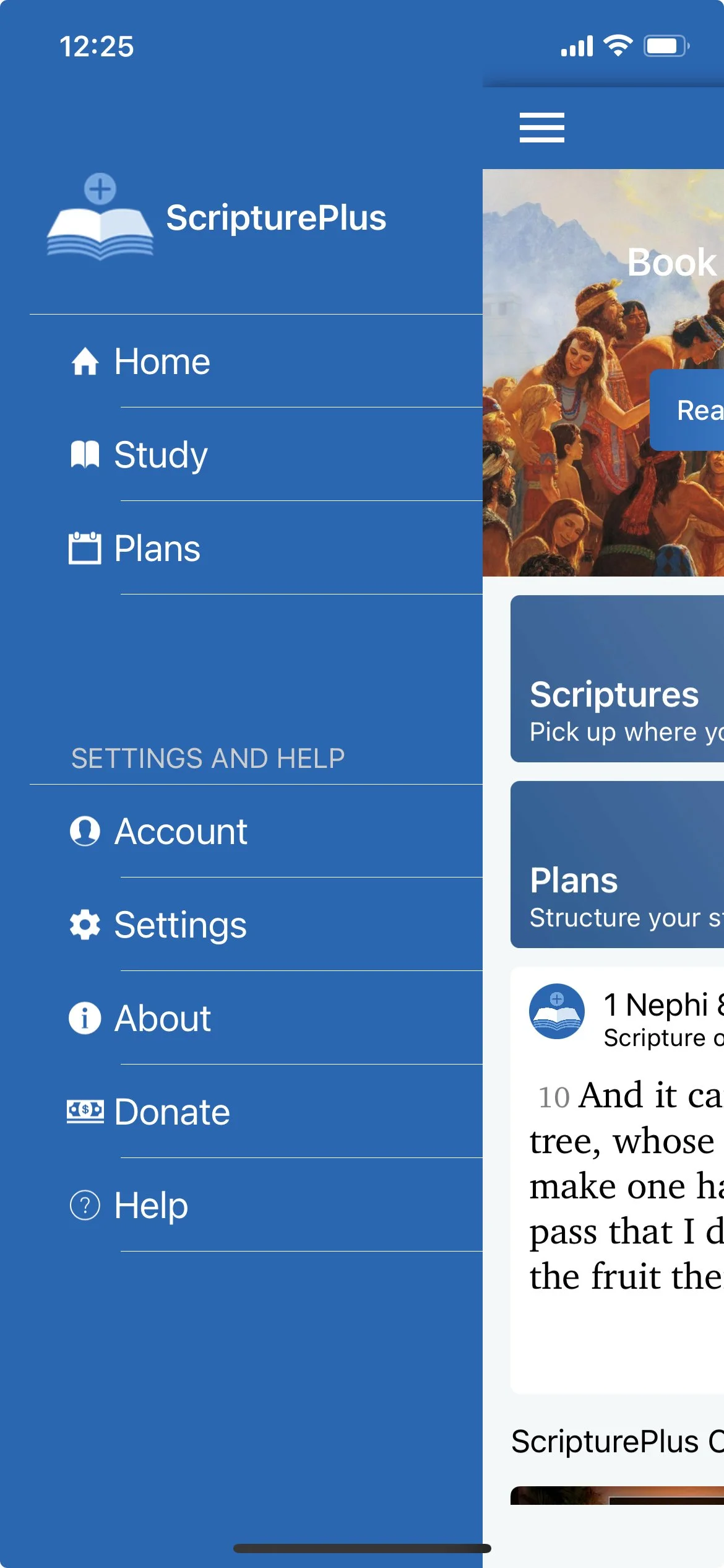
Menu Redesign
In this situation, like many you’ll see throughout, all the content stayed essentially the same, but the user interface design was reworked. One feature they didn’t have that they wanted the new design to incorporate was the Media Library, which would essentially show all the most recent media content created by Scripture Central—videos, insights, images, and historical settings.
I also thought that “Study” was less clear than “Scriptures,” so I recommended that they change the navigation text to “Scriptures.” Similarly, I thought that “Study Plans” was more direct than “Plans.” I added to the icon library of the brand as I drew new icons for these main menu options.
Since “Settings,” “Contact Us,” Donate,” “My Account,” and the language toggle are not going to be used as much as the first set of menu options, I differentiated them with size, spacing, style, and color. The menu feels much cleaner without the less-important options taking the same visual prominence as the more frequently used options.
Finally, where in the previous rendition the menu seemed to slide out adjacent to the active screen, pushing the active screen to the right, in my redesign I created a menu that would pop out “over” the current screen. It creates contrast with a dark drop shadow and a transparent black overlay atop the current screen. This helps reduce competition between the menu and the current screen, which felt a little chaotic in the previous design, which lacked anything obscuring the current screen, which gave it similar prominence and hierarchy to the open menu.

Above left: Menu redesign Above right: Previous menu design
Above: Redesigned landing screen
Right: Old landing screen design
Cleaning Up the Landing Page
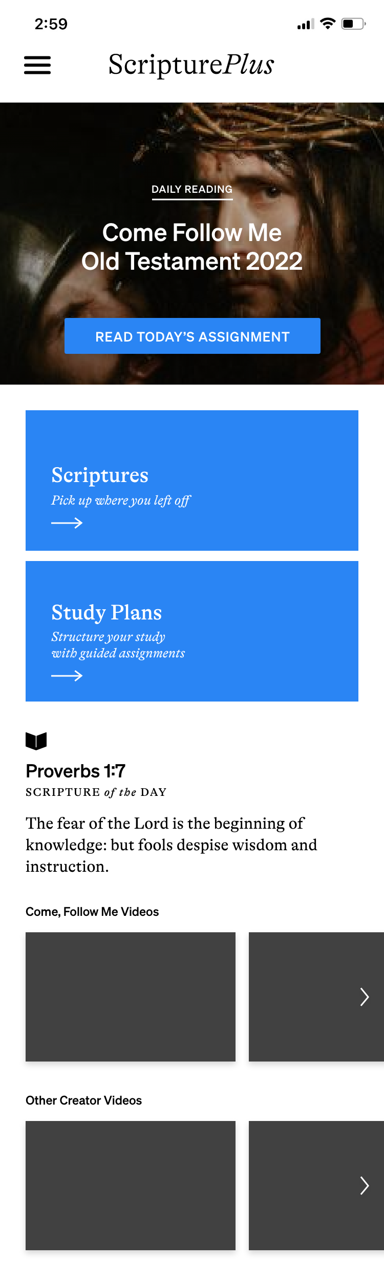
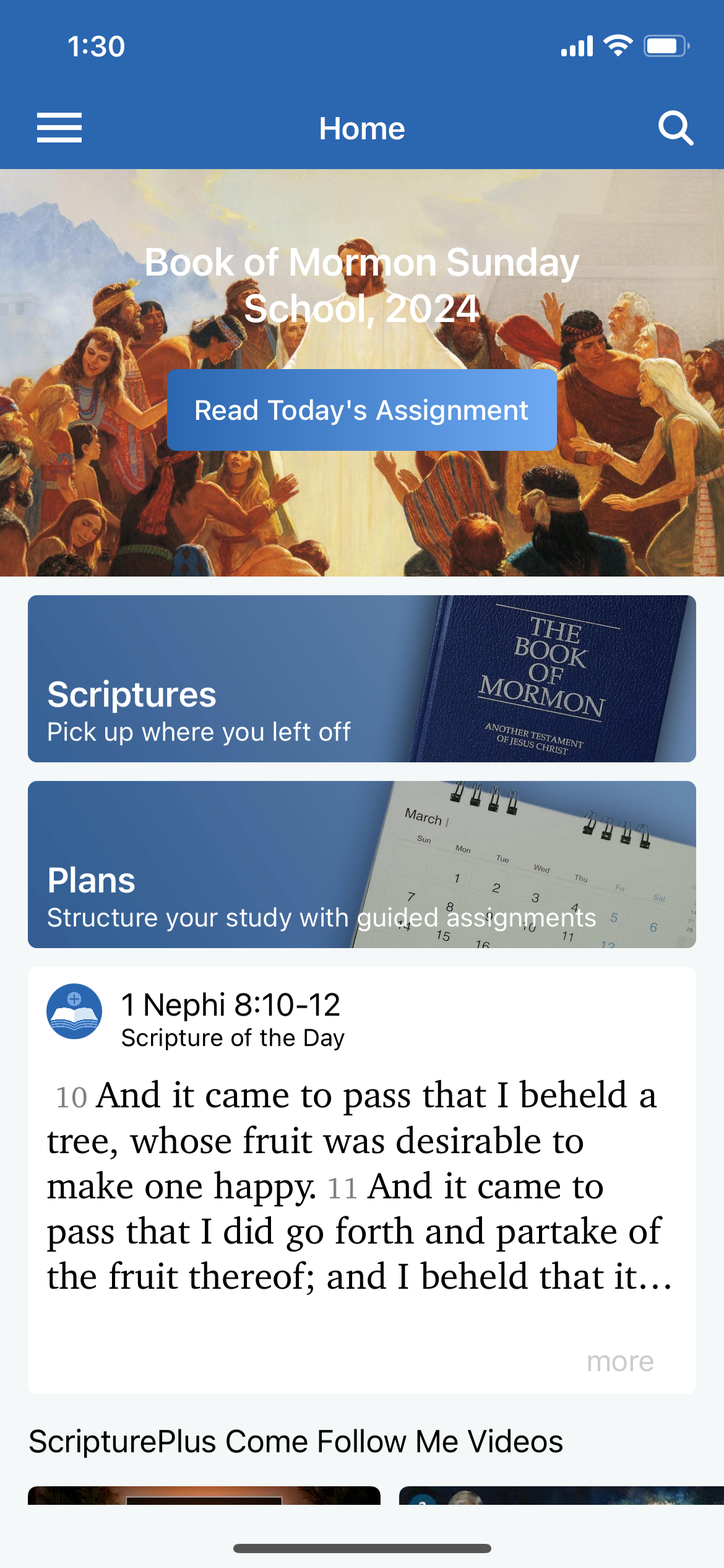
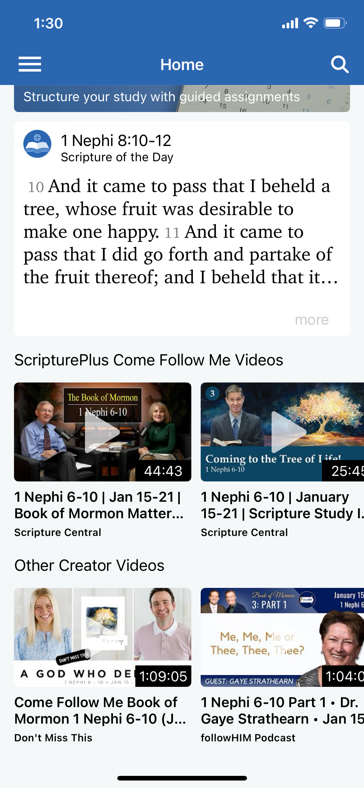
Shown to the far left is the redesigned home screen. To the immediate left are two screenshots of the old design for the home screen.
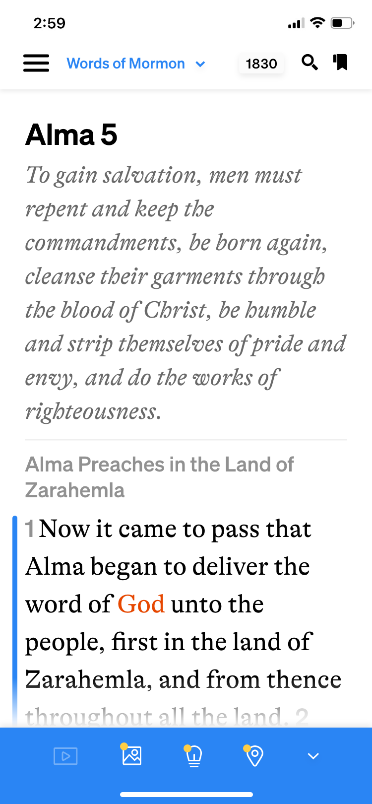
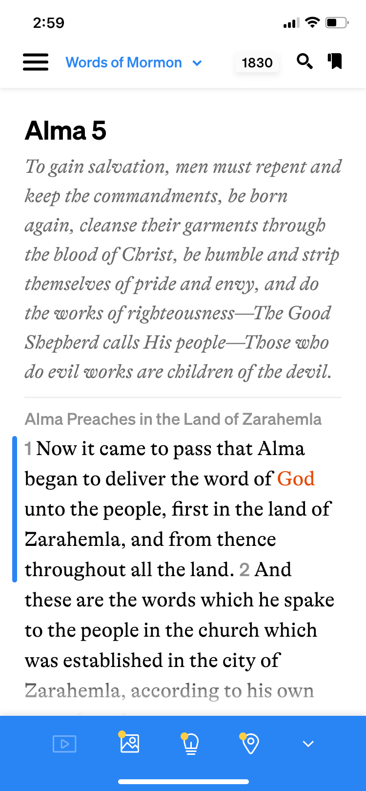
The first change I made was to add the ScripturePlus logo to the top of this page; since the user opens to this page every time they open the app, it is easily discovered to be the landing screen. The logo is visible here, but disappears on other pages where other navigation info is needed at the top of the page.
On the initial design, there is low contrast between the headline text and the header image, which makes it uncomfortable to try and read. Additionally, there is a gradient on the button that is not repeated anywhere else in the brand and doesn’t feel helpful, clear, or part of the brand.
To address this, on the redesign I added a dark overlay to the header image to create clear contrast between the text and the image. I also changed the button to the same blue we’ve been using to indicate buttons or active areas throughout the brand. The header image is also a little bit larger in the redesign to accommodate sufficient negative space between the image, the text, and the button to feel airy and clean.
Further on the original page design, below the header image are two buttons to navigate to the scriptures and the study plans. However, there aren’t any visuals to indicate that these are buttons unless you read the text. It’s somewhat unclear. The background images may be helpful to let the user know what the content is, however, they again do not have sufficient contrast with the overlaying text, and the images are generic and not specific to the brand. I switched up this area by changing the background to a solid blue that will indicate usability, and added an arrow below the text to further indicate usability. I also increased the size of the containers slightly to add negative space and balance so that the buttons are easy on the eyes.
Moving down, we have the “Scripture of the Day” area. Again, there was the same issue before where the text was not given enough breathing room. In order to read the full scripture, you had to tap it, upon which a pop-up would open with the full passage. However, since the scripture of the day is at most a few verses, I opted to display the full scripture of the day on the landing screen in my redesign. This feels more simple and easy. The scripture citation is larger and bolded, to draw attention to it and differentiate it from the subtitle “Scripture of the Day.”
The final area of the landing screen has the videos. The thumbnails are small but contain a lot of information. I modified these areas by removing the text below the thumbnails, as they simply repeat what is already displayed on the thumbnail. I also added an arrow to indicate the ability to scroll left-to-right.

Intuitive Scripture Study
Shown to the left, top to bottom, are the redesigned screens for the scripture study area followed by the old versions.
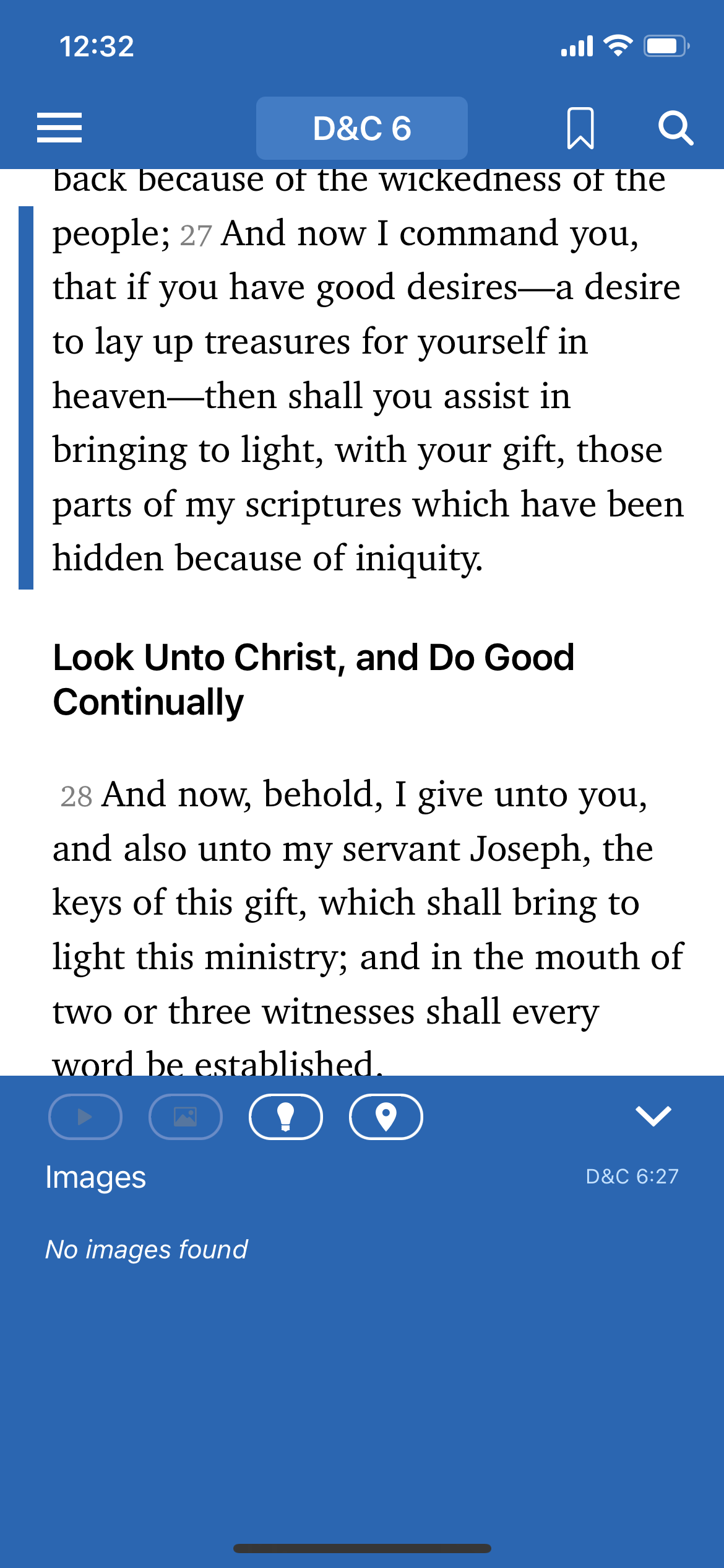
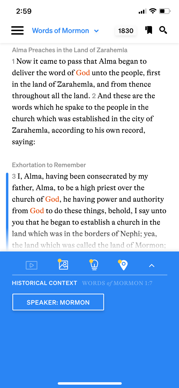
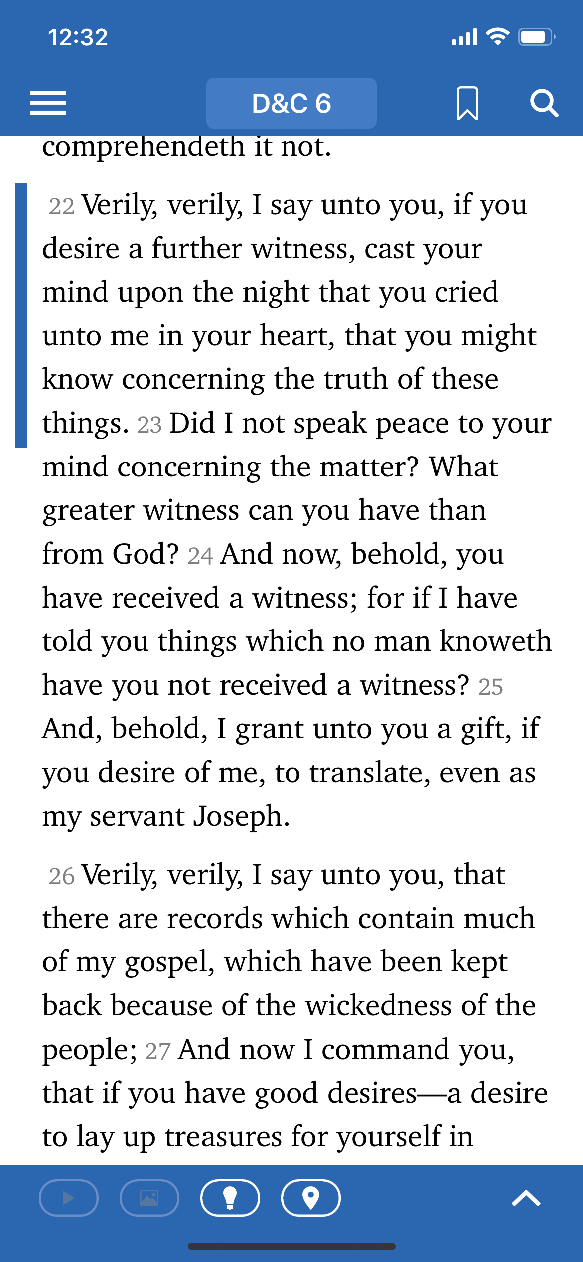
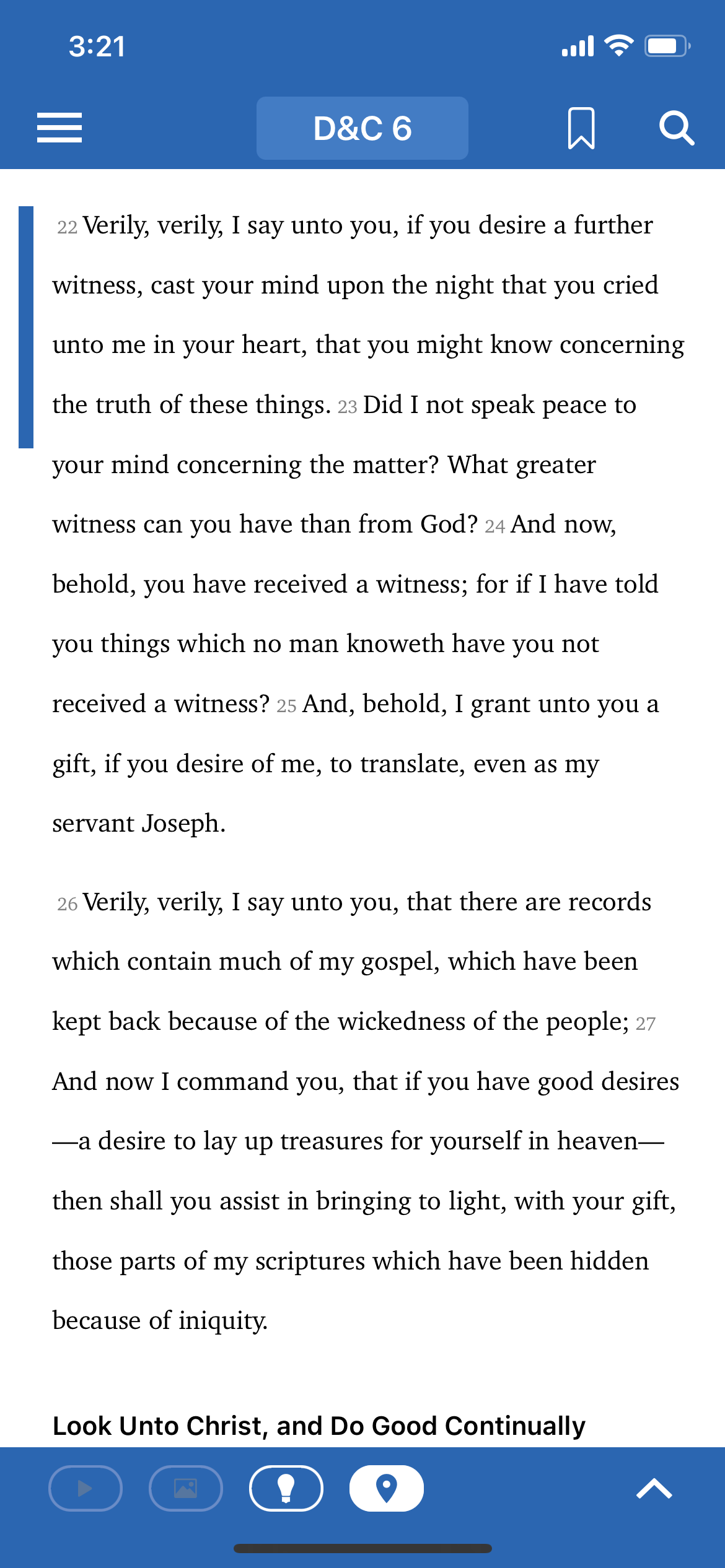
Previously, as soon as you entered the scriptures, the default was to have the bottom bar open. It took up about 30% of the screen and overshadowed the scriptures in weight with its deep blue color. The bottom bar adds context to the scriptures; on the left, the floating blue bar indicates the active verse, and as the user scrolls down, the blue bar follows their progress. The bottom bar correlates with this selected verse and suggests associated videos, images, insights, and historical setting information. While this may be helpful, I recommended defaulting to having this area collapsed unless tapped, so the reader can focus on the scriptures, the true purpose of this screen.
Additionally, I noticed in my research that most scripture study apps allow you to tap the main scripture area to disappear the top and bottom menus, to allow the user to reduce visual distraction and really immerse themselves in the reading. I recommended that they adopt this feature, and showed an example of what that will look like. Included in my redesign is a subtle white fade at the bottom of the screen, obscuring the last line of text closest to the bottom of the page, which I thought was helpful to indicate that there is more text if you continue scrolling.
You’ll also notice that I made tweaks to both the top nav and the lower pop-up area.
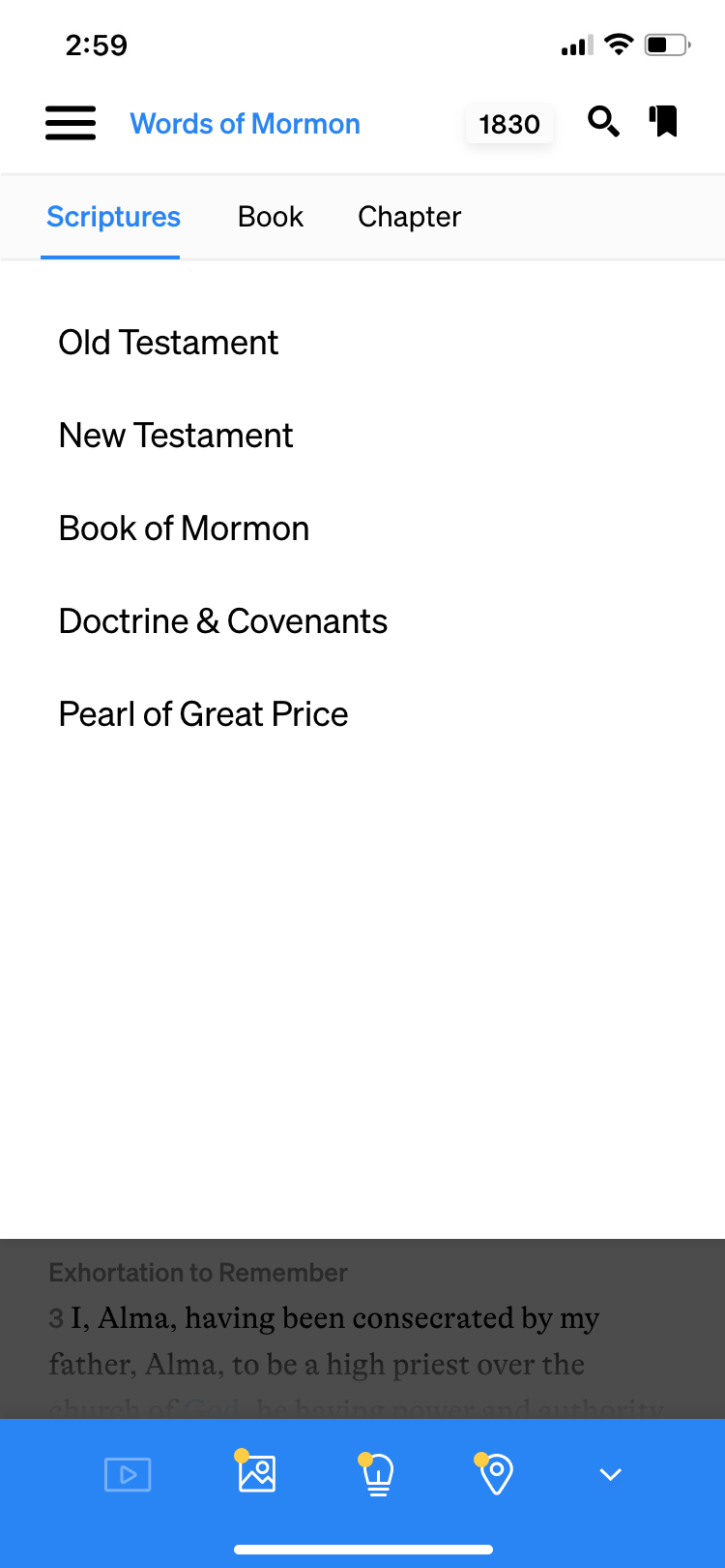
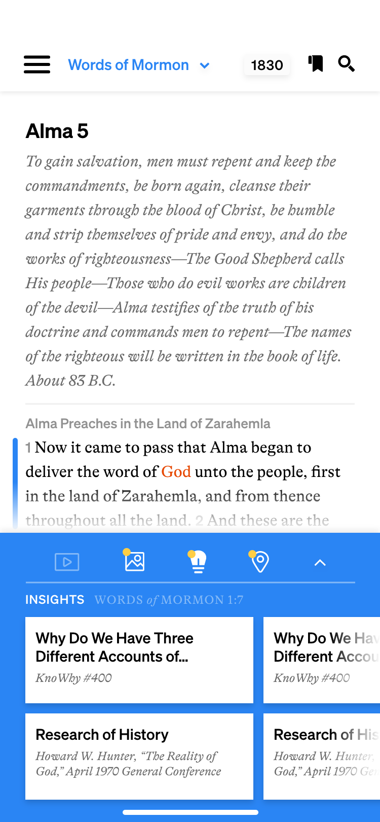
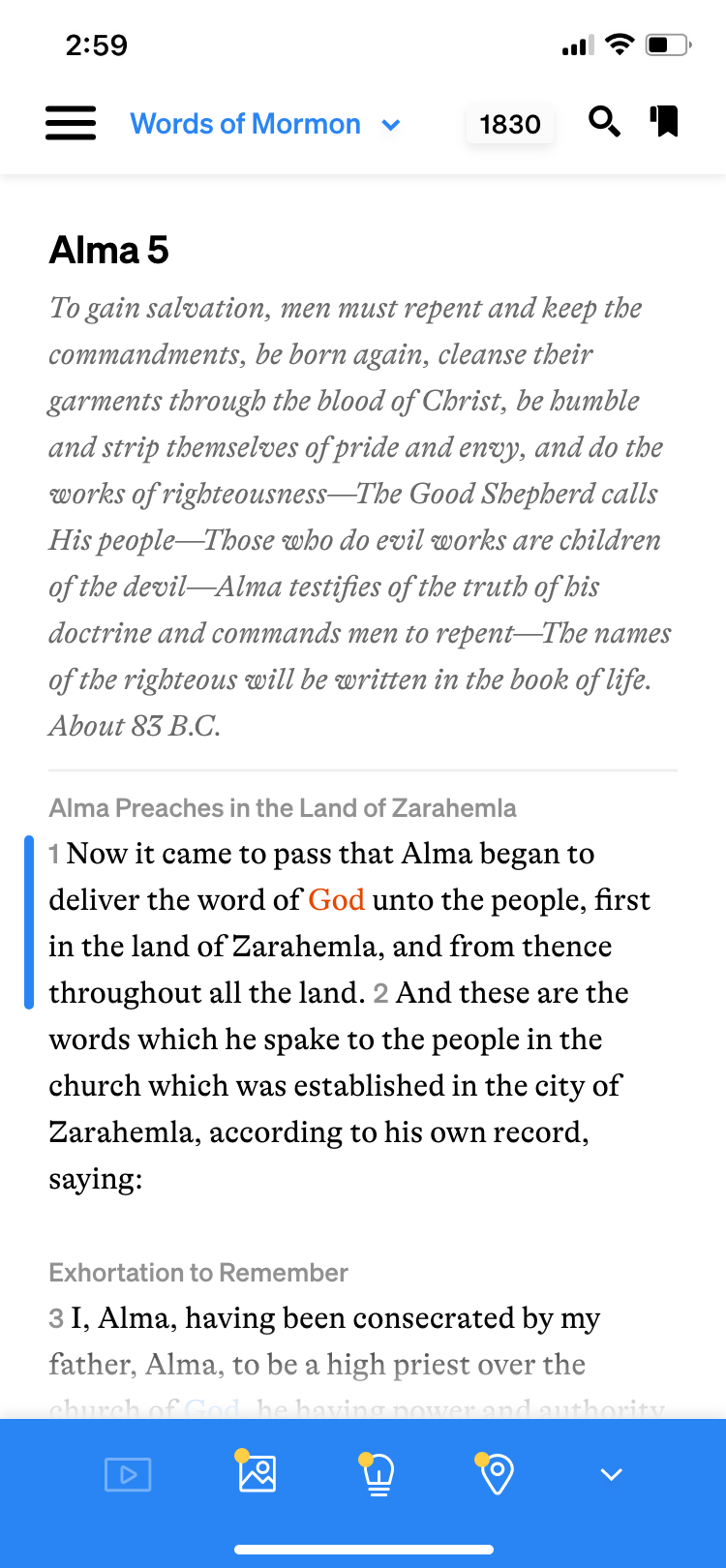
For the top navigation, I softened the look of the hamburger menu, and left-aligned the text with the current book of scripture, which is shown in bright blue and has a drop-down arrow to indicate usability. Additionally, in the previous version of the app, you could choose which translation or version of the book of scripture to read, but it was very difficult to find where to toggle between different versions. I updated that feature, adding it to the top nav here where it says “1830.” Each version of the scriptures has a 4-character abbreviation, but if you tap “1830” you can see the full titles of each version and easily toggle between them. This is especially helpful if you’d like to see the differences in one verse between different published versions or translations of the scriptures. Finally, I simply redrew the bookmark and search icons.
On the bottom area, I redrew those icons as well, so that they would feel unique, contemporary, and on-brand. I also thought that the outlined pill areas on the old version were unnecessary, so I removed those. I also thought that additional clarity could be brought to show that the icons had something to show. I added a small yellow dot to the icons that had information to display. These feel reminiscent of the little bubbles one would see on a phone homepage to indicate notifications on their apps, like texts received or unread emails. Additionally, when I first used the app, I didn’t realize that the content in the bottom area correlated to the selected verse. To help clarify, in the redesign I added the scripture citation correlated with the content—seen here as “Words of Mormon 1:7.”
I created an extensive color palette for Scripture Central knowing that it would need to stretch to allow for many branches of the brand to have their own unique color that would fit into the family. Knowing that, I included multiple shades of blue, and used the bright blue shown here as the de facto ScripturePlus color. It feels much more contemporary and welcoming than the previous blue, which was much more muted.


Settings and Text Options
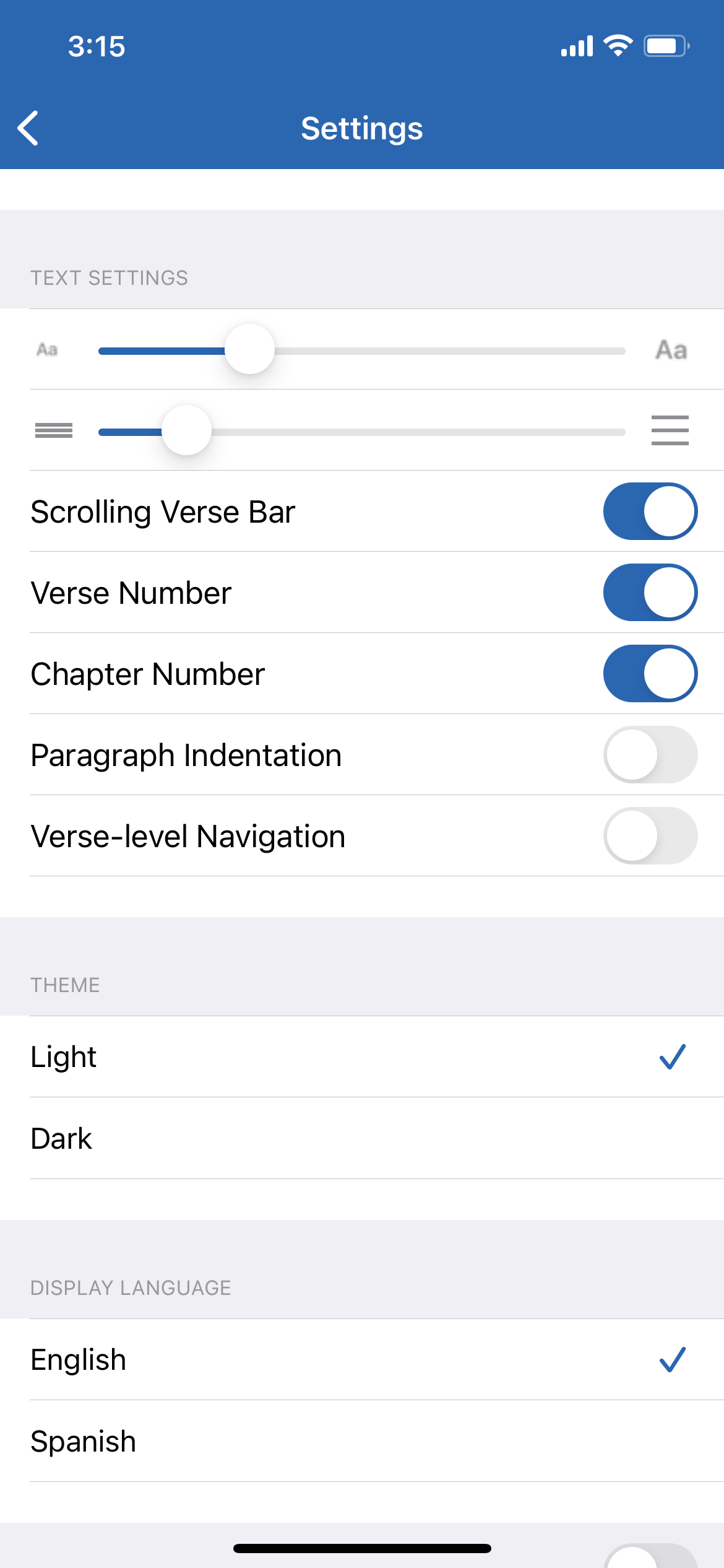
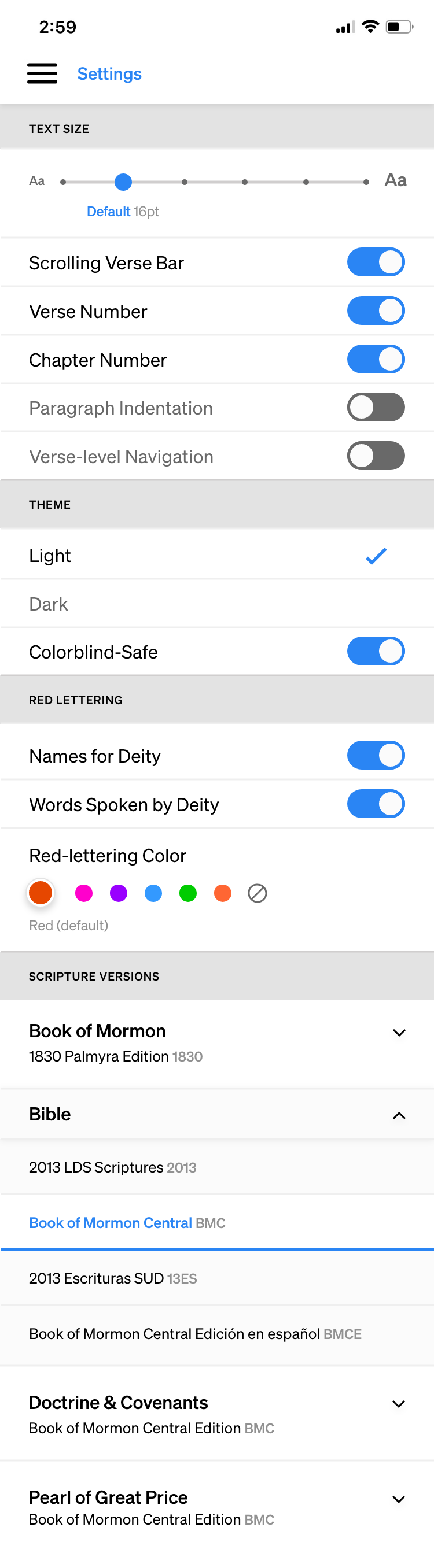
The user audience for ScripturePlus spans from young adults to older adults with declining vision. One feature we wanted to carry over from the old version of the app was the ability to view the app with larger or smaller text settings.
To the far left, I’ve shown the original settings area. One issue with their text settings was that you could skew the size of the text and the line spacing separately, which could result in text that is not optimized for readability. I’ve shown an example of this to the immediate left.
In order to correct this, I developed 6 different text sizes. The default is second-to-smallest, as generally, when users need to change the text size, it’s usually to enlarge it. The user can select any of these six text sizes, and it will automatically set the leading to the optimal size for readability. These examples are shown beside and below the redeveloped settings screen. They go from 14pt body text, 16pt body text (default), 18pt body text, 21pt body text, 26pt body text, to 30pt body text.
Additionally, if a user plays with the scales of the text size and leading, and wants to go back to the default, there is no way to do that in the old design. I added subtext below the slider that denotes the default setting and also clarifies what point size is used in each option.
Other additions to the settings menu include the alternate red-lettering colors and the area to select which version of the scriptures the user would like to have shown.


Reading Plans
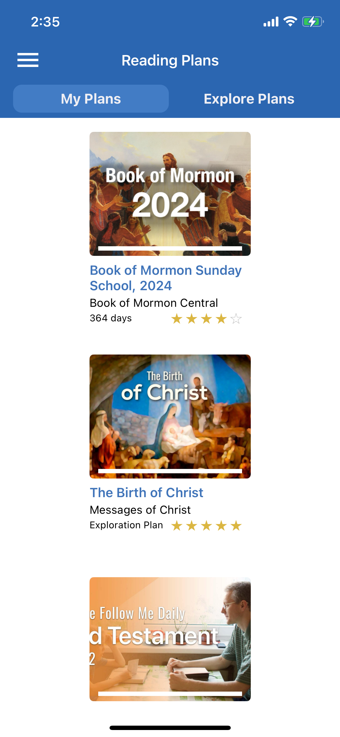
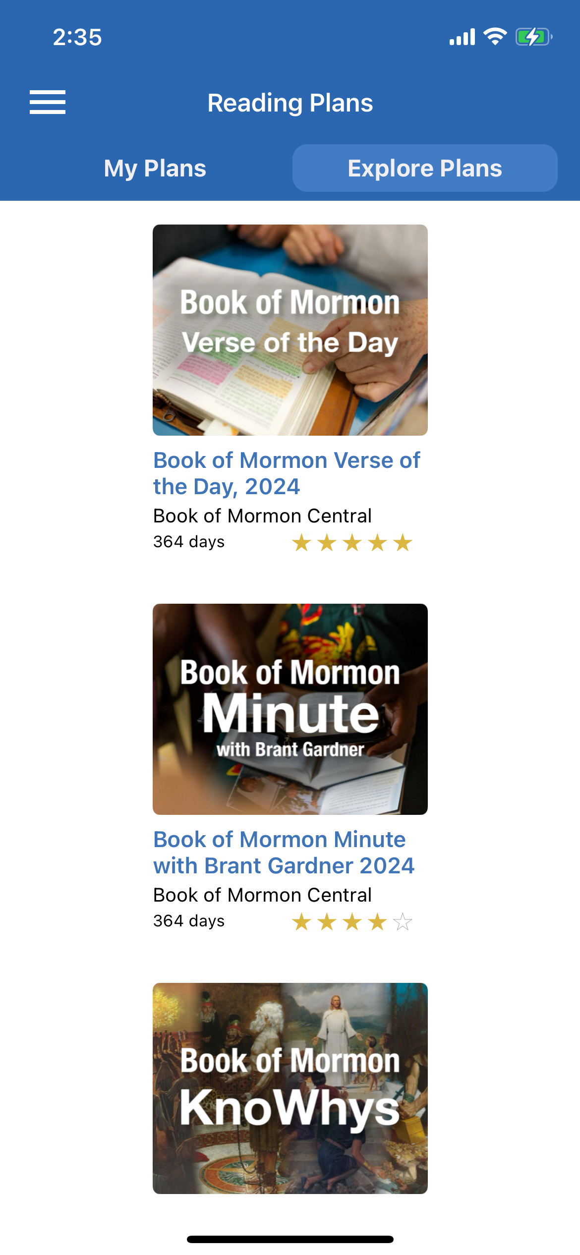
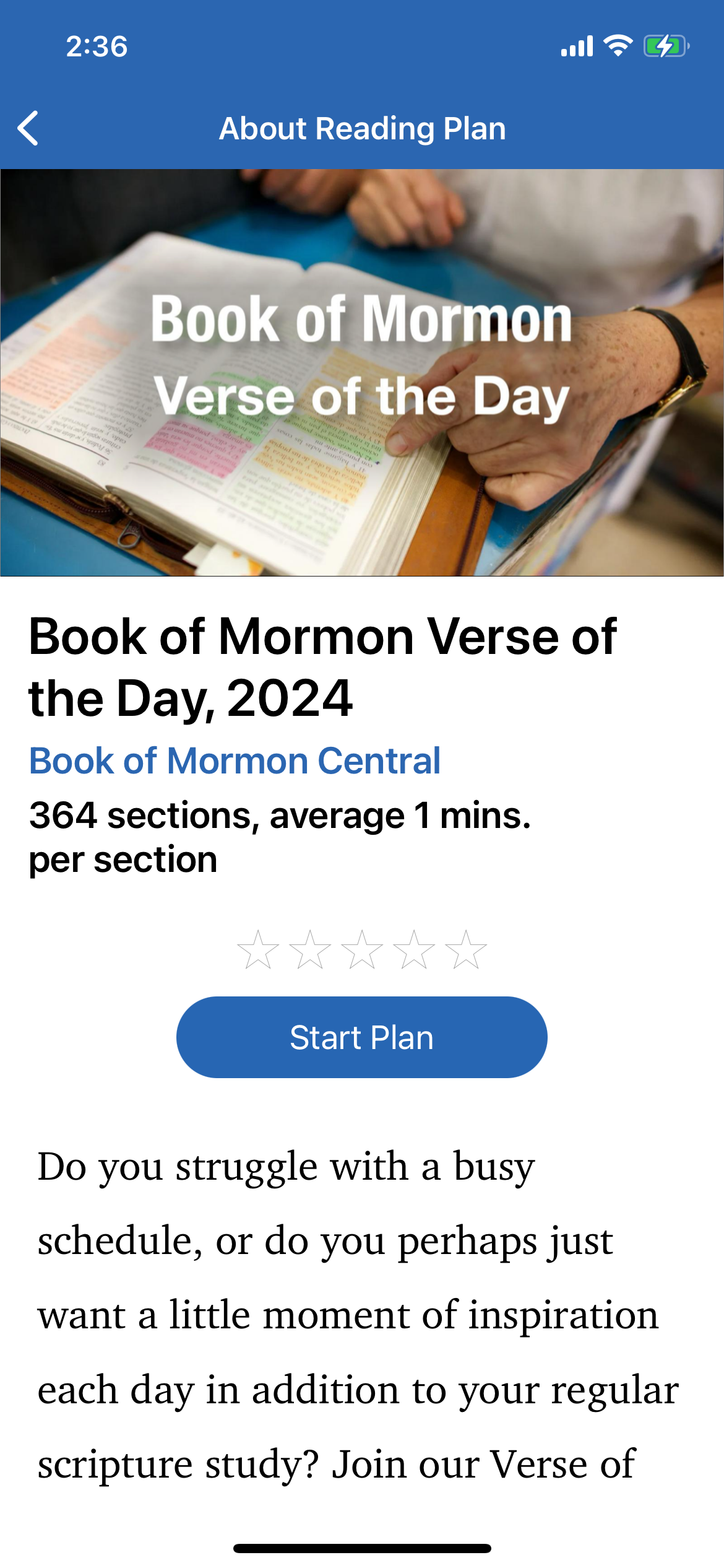
In addition to the scriptures, the ScripturePlus app also offers study plans. These typically last between a few weeks and a full year of scheduled reading. Currently, they only have a few plans, but they would like to offer more. As on previous screens, I was responsible for a UI redesign here. I have shown side-by-side the redesigned screens and original screens for the “My Plans” area, the “Explore Plans” area, and the study plan detail page.
Under the “My Plan” area, I felt that having the plans centered in the middle with significant space on either side was a poor use of space, so I created modules that fill the width of the screen. The image associated with the plan is shown to the left, and on the right, we have all the text information—duration of the plan, rating, title, subtitle, author, and percentage of completion. Additionally, I chose to differentiate completed plans by moving them below the active plans and putting an overlay on both the image and the text areas.
Next, for “Explore Plans,” I again reorganized the center-aligned blocks for the plans. Instead, I reiterated a scheme that has been used on other screens, where an image represents the plan. It is covered with a dark overlay between the image and the white text above to create high contrast. These containers are organized by Most Popular, Most Recent, etc., and scroll left to right. At the bottom is a list of recently viewed plans.
Finally, for the study plan itself, it seemed redundant to have the title both on the image and below, so I kept the title off the image itself. Besides adding the length of the program and its rating, all the information is the same, just updated to fit the new branding.


Media Library
Since there was no pre-existing structure for the Media Library, I came up with what is shown here. There will be a header with a CTA promoting content, as well as quick tags at the top of the page to quickly view any of the 4 categories of media. The “Content Filters” button, when tapped, opens from the bottom of the user’s screen, as seen in the 4 screens with the pop-up filter menu. This allows the user to easily search for and filter content as needed. To exit, the user can simply tap any part of the screen outside of the pop-up, or tap the “X” on the pop-up.
Additionally on the Media Library screen, there is a scrollable (left-to-right) bar with logos and images representing different contributors/creators. Below that, videos are displayed left-to-right in a scrollable fashion, grouped by whatever category Scripture Central would like to display—be it the most recent CFM videos, the most popular videos, etc.


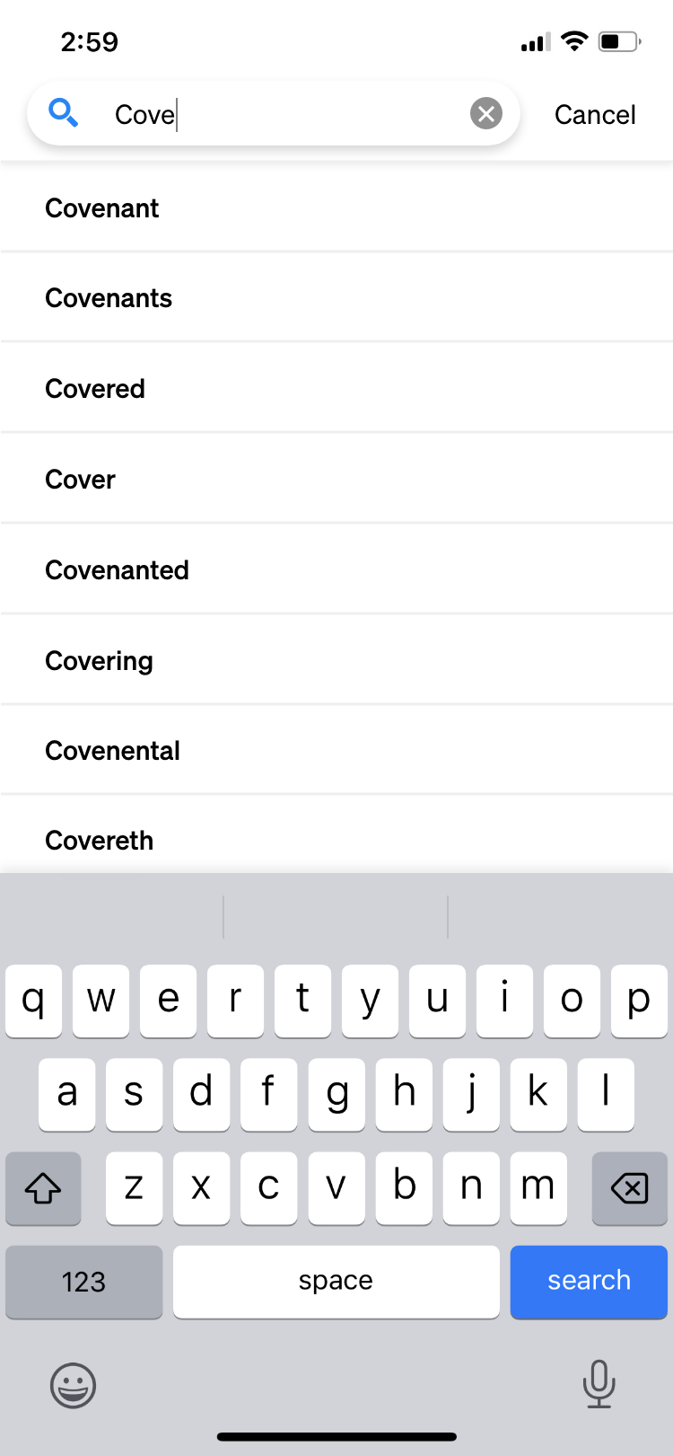
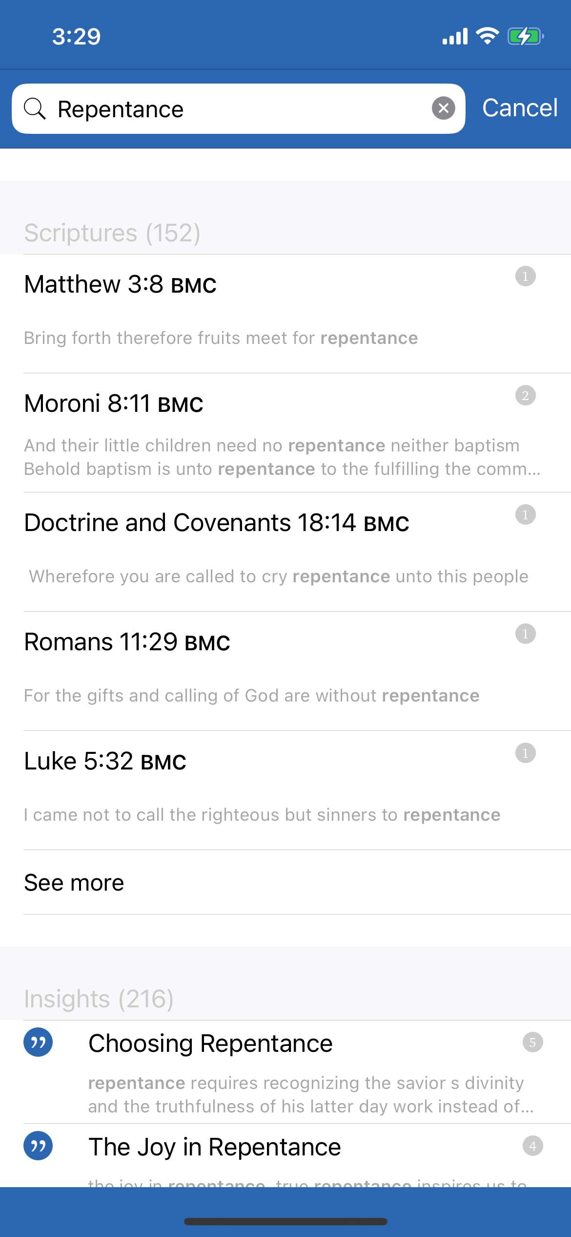
Search Function
Just as on the website, the search function here is vital. I’ve included 2 screenshots of the pre-existing search function. The search results were organized by category (scriptures, insights, media, historical settings), but I thought it would be more intuitive to show all results according to relevance but add search filters. On my redesigned version, I added tags at the top that can be used as filters, or, alternatively, the user can tap the “search filters” area at the bottom of the page to get a more thorough pop-up filter menu.
When the used selected a search result, it led to a pop-up with the passage referred to and the ability to navigate to that passage. However, there was no way to go back to the search results. I added a bar to the top of the scripture page that will alert the user that they can navigate back to the search results. This is easily dismissable by clicking the “x” in the corner. Finally, if the scripture passage contains the search terms, those are shown in bright blue.


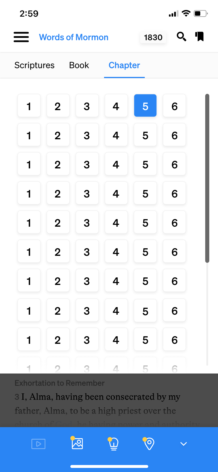
Scripture Navigation
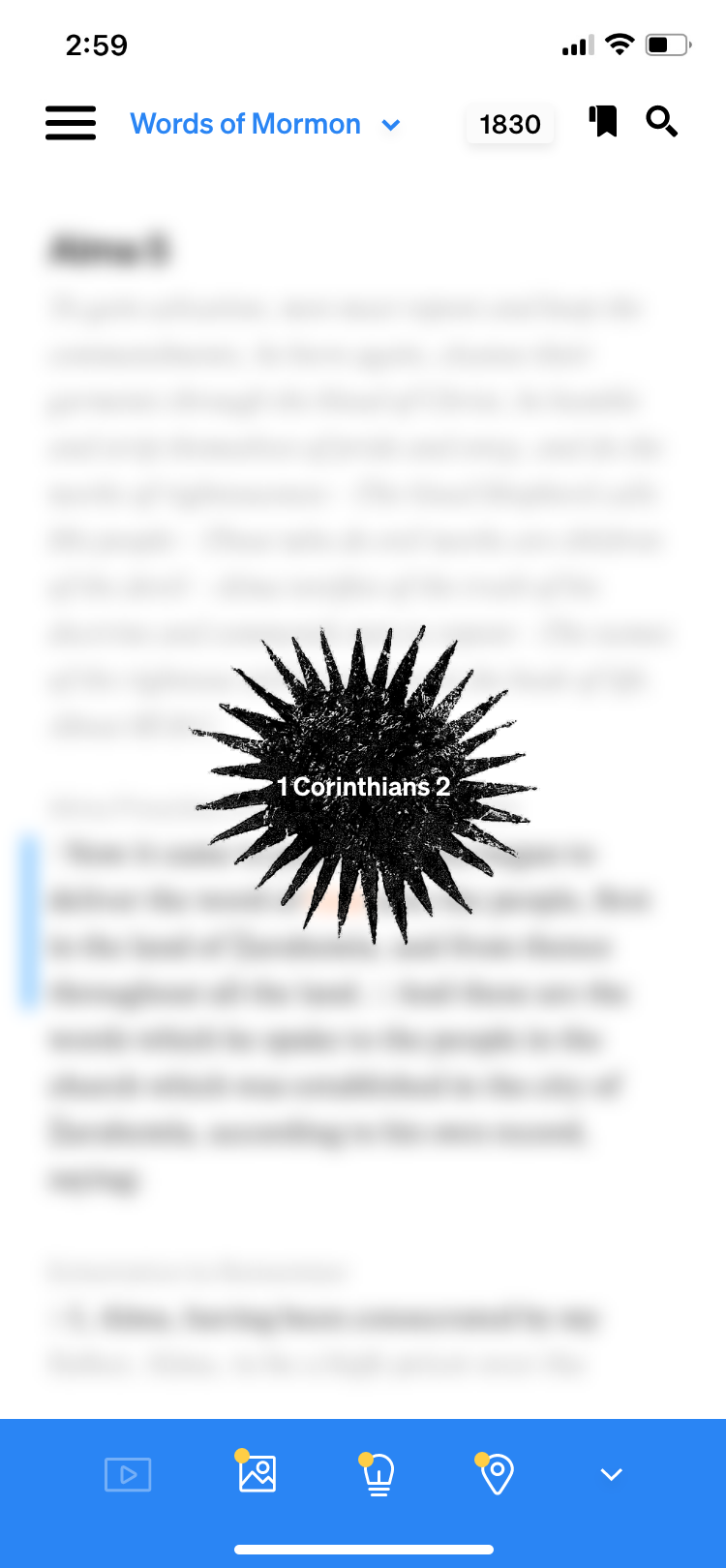
I took into account situations that were not being addressed previously. Shown to the far left is the loading view; often, when a user is navigating to a book of scriptures they haven’t previously viewed, the content takes a moment to download. While this is happening, the screen will show the slowly spinning star illustration with the content title on it, with the background blurred and showing animated text scrolling behind it.
To the immediate left is the scrubber view. The app is set up to have the scriptures on an infinite scroll. If the user begins to scroll continuously, the scrubber on the right hand side of the screen will pop up and they can grab hold of it and drag it down the screen to accelerate their scrolling. The indicator in the middle shows the location as the user scrolls. Both items disappear as the user stops scrolling.
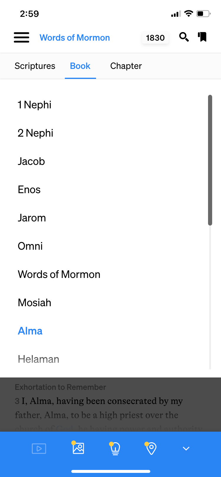
Below these screens, I have shown the conventional scriptural navigation. This is the same structure that the app had before, just shown with the new styles applied. This drop-down appears when the user taps the book of scripture at the top of the page.