

Scripture Central Desktop
Reorganizing and simplifying a whole brand family
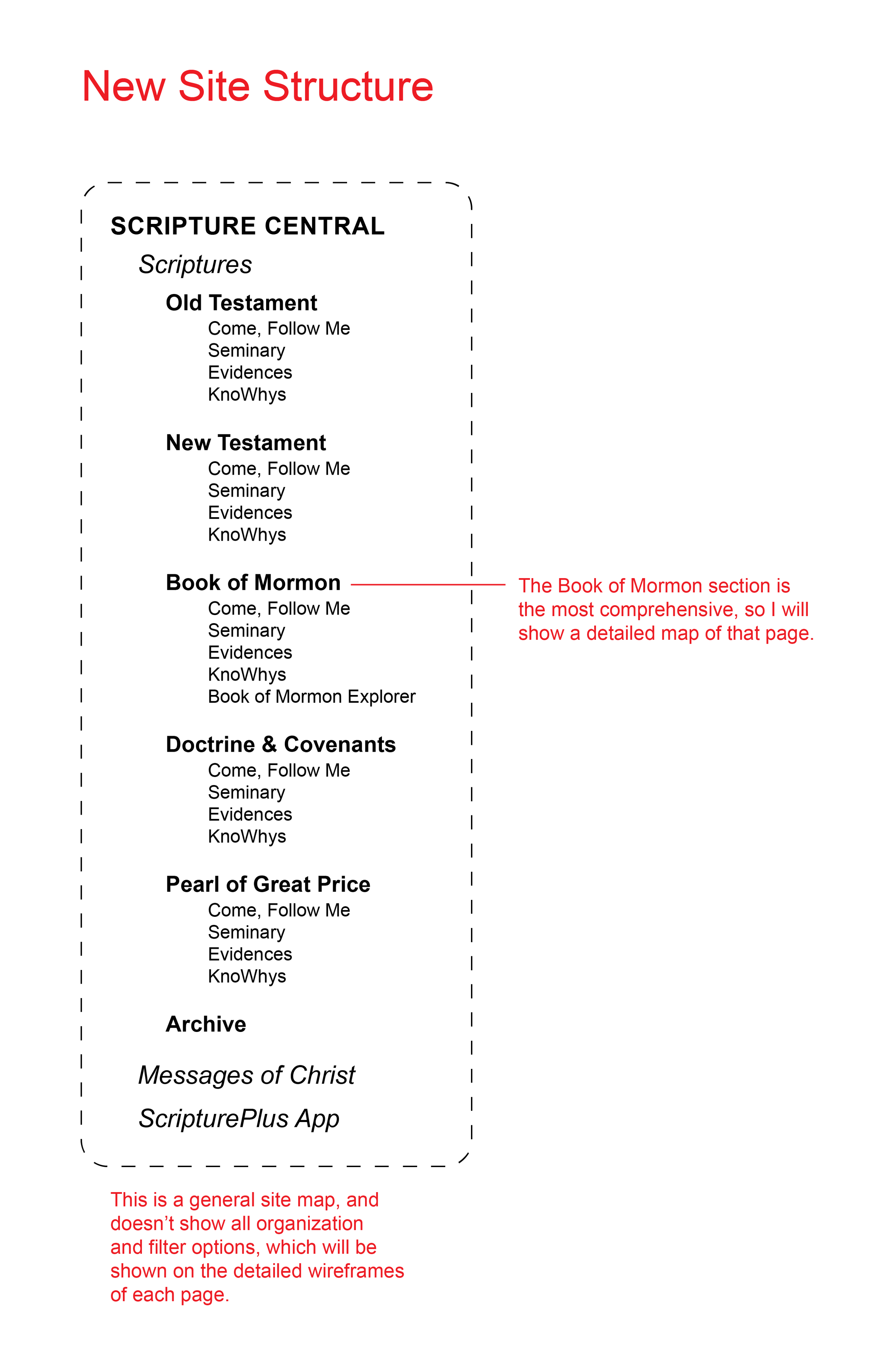
What is now known as Scripture Central was previously a large group of websites, all with the name “Central” in the title, but all with distinct site organization, branding, and content. While the content has a lot of crossover and similarities between these sites, users had to navigate to the different websites just to see content that could logically be organized adjacent to each other.
Instead of organizing content on the site by type of content, I reorganized everything to correspond with the book of scripture it related to. Scripture Central became the larger umbrella, one site where everything could be localized. Where before, “central” was a bit ironic considering the sprawling sites, it is much more appropriate for the product now.
Below: Site reorganization details.

Below: Walkthrough of various sites owned by the brand.
Site Audit
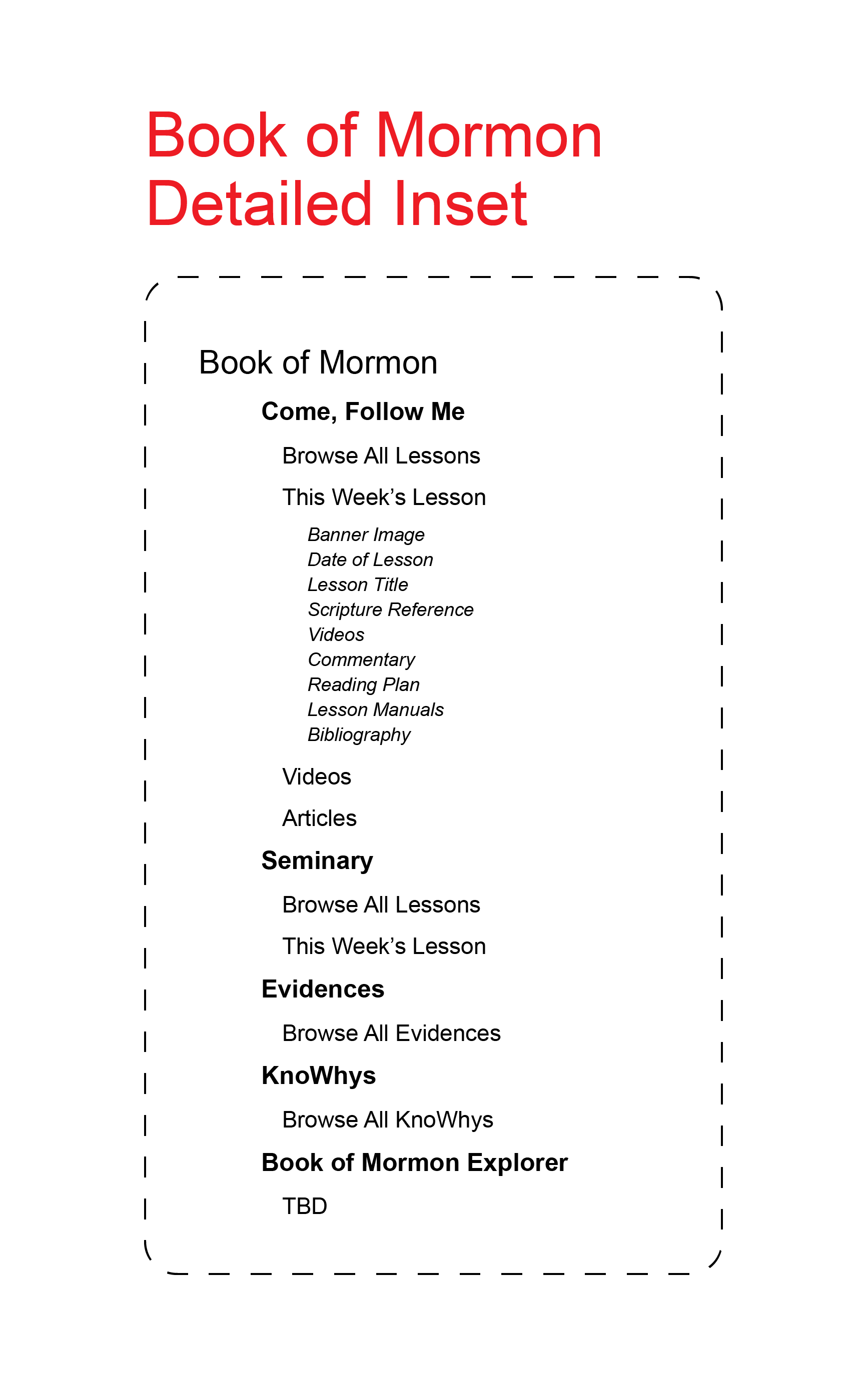
Overall, the biggest concern was consistency and convenient navigation. The Book of Mormon page was used as a template for all the other scriptural pages, because they all had the same content types, but the Book of Mormon had the most content. The Book of Mormon Explorer page was not created, as the client had no current content for the page. Additionally, I will show the Archive page, Search page, and Donation page, as those were also changed significantly.
Finally, the previous site was marketed only towards active members of the Church of Jesus Christ of Latter-day Saints (also known as Mormonism or LDS) who were also avid scriptorians. The brand wanted to increase its appeal to a wider audience of Christians interested in studying the scriptures, who may be familiar with the Bible but unfamiliar with the LDS canon of scriptures. To help with this on the UX/UI end, I recommended modules that were more introductory to what the brand was, or what the book of scripture was.
A Comprehensive Site Navigation
After reevaluating the site structure, I took a look at what this would look like on the site itself. To the right is a wireframe that I developed after looking at other brands with multiple sub-brands (ex: Williams-Sonoma, West Elm). It includes a small navigation at the very top, so you can stay on the main Scripture Central page (“Scriptures”), navigate to other sister brands, or link to download the Scripture Central App. Previously, too, if a user tried to navigate to the site in another language, it would take them to a completely different site with a different organization and look. Here, we’ve add a standard language toggle and took note to choose a typeface that would support all the languages the site could potentially be translated to.


Seen above are two initial wireframes for the Book of Mormon specific landing page. On the right is a final version of the page with UI styles applied. Both have the same content organized in slightly different ways. Compared to the old version of the page, there is less content, simply because we now have a page for Scripture Central that can hold some of that content. An addition I recommended to the client was to add timelines to the landing pages of each book of scriptures so that users could easily visualize the differences in the different areas and where they overlap. This feature was well-received, but they do not currently have the content to populate this feature so it will be added down-the-line.
Additionally, since the Book of Mormon is unfamiliar for anyone visiting the site outside of the LDS faith, the first module on the page has a brief introduction to the Book of Mormon.
Book of Mormon: Landing Page

Come, Follow Me is a study program developed by the Church of Jesus Christ of Latter-day Saints, and much of Scripture Central’s content is developed to go hand-in-hand with this program and enhance learning. It’s the most common reason people use Scripture Central, so that content also takes front-and-center on the landing page.

For Come, Follow Me (CFM), I decided to use the Bible as an example because it is separated between the Old and New Testament, and I wanted to show that use case scenario.
Every year, Come Follow Me focuses on a different book of scripture. In 2022, it spotlighted the Old Testament. The first module under the banner image is a link to the current week’s lesson, because in this case, that is the lesson assigned to the current week. If you were to toggle to Book of Mormon CFM in 2022, it wouldn’t have a “current” lesson as the Old Testament was 2022’s theme.
Below that is a gallery of highlighted content, which could include articles from the Archive, KnoWhys, and Evidences.
Then, you can view all the Bible CFM lessons in a grid view. It defaults to the Old Testament lessons because that’s the featured topic, but if the New Testament was featured that year, it would default to the Old Testament. If neither were featured, it would default to the Old Testament. You can easily narrow down the lessons by individual book of scripture by selecting the tag with the corresponding name.
Again, since the Old Testament is featured in this scenario, the first lesson shown in the grid would be the current week’s lesson. Following would be all future lessons. You could view past lessons from earlier in the year by clicking “Show past lessons,” in which scenario it would show the year’s lessons chronologically from January to December.
Each lesson tile has the featured image with a transparent black overlay, and displays the featured scriptural passage, the date of the lesson, and the lesson’s title.
What I would do differently:
I completed this project in 2022, and since then I have learned a lot and improved my skillset. I think it’s important to acknowledge that I would do things differently if I had then the expertise I have today. For example, throughout the site, there are conflicting styles that should be consistent for clickable areas, linked text, hover styles, and active styles. Additionally, the contrast levels of some colors are not ideal for usability or accessibility.
On this page in particular, the navigation on the grid is somewhat unclear. I would make it more overt that the lessons shown were from the current date onward, and have a clearer way to navigate to older lessons. Additionally, the differences between the lessons with no image and the lessons with images and their respective hover and active states are unclear.
Come, Follow Me
The layout of the CFM lesson page did not change significantly. Most of the content was the same, however, it was extremely text heavy before and areas bled together, hindering usability.
One big change on this page was how commentary was organized and displayed. Previously, commentary opened a new tab and rerouted the user to a different page. (See the image below). Here, everything is centralized.
Because commentaries are long, I decided to make them collapsable. Here, the middle section is expanded. Each commentary would have a short title with the author’s name and a short description. If the user would still like to see it in the original page, they can click “Open in Archive.”
A note: Only one commentary can open at a time. If you have one open and drop down on another, the first will automatically collapse.
Finally, the commentary is organized by scriptural passage. In this example, the week’s passages include Ruth 1-8 and 1 Samuel 1-12. This is the longest use-case scenario; most weeks will have less chapters. The user can navigate by selecting a chapter and seeing all the commentary relative to that chapter. So as to not overwhelm, the commentary will only extend so far vertically and past that point a scroll bar will be available.
Next, for the weekly study plans, I also made some sizable changes. The old version of the Reading Plan is shown below the Commentary screenshot. Essentially, it was just a text list with embedded links.
Instead, I created a left-to-right scroll between the days of the week, and recommended to the client that they split up each day’s study plan into a couple of categories—for example, a verse of the day, scriptures pulled from the week’s assignment, and videos. Commentaries will no longer need to be displayed on the reading plan as they can all be displayed in the commentary area.
Come, Follow Me Detail Page
Above: Final redesign of the CFM Lesson Detail Page.


Within the LDS faith, seminary is a scripture study program for high-schoolers. It’s a daily class that typically takes place locally before school and is taught by a local congregation member on a volunteer-basis.
Like CFM, seminary follows the same rotation of spotlighting a book of scripture every year.
Currently, Scripture Central does not have extensive content available for seminary. However, they are developing more content over time, and I designed the page to suit the ideal situation for them to implement when the time comes.
It has definite overlap with the CFM page; similarly, you can sort content by book of scripture, and easily navigate to current weeks. Unlike CFM, Seminary lessons are daily, but local teachers can generally decide how much of the week’s content they cover each day. Because of this, I still organized lesson material by week. Additionally, Seminary content does not have imagery associated with it.
Lesson blocks prominently show the scripture passage covered, with the week number and dates shown smaller.
The bright blue state is the hover state, and the very light blue state is the active state.
Seminary

The current seminary pages only have video content, but it should be easy to populate the other areas mapped out on my version with existing content currently found in other areas of the organization, but still pertinent to the scriptural topic at hand.
In these video areas, the text links would open the video in a new tab on Scripture Central’s YouTube channel, but you can also click on the video image itself to play it on the current page.
The articles, when clicked, will open a new tab and display the articles in their native context (they could be evidences, KnoWhys, or pieces from the archive.) The light blue container with a drop shadow represents the hover state, and the bright blue container with a drop shadow represents the active state.
I also added an FAQ area here, which I recommended to the client because in the context of teaching teenagers, there usually are a lot of questions. The scriptures teach Christian principles in the context of a society and culture that is, in general, unfamiliar to the modern-day teen, and uses verbiage that can be difficult to interpret. The hope is that this area can pinpoint at least the most pressing questions associated with the passages of scripture referenced that week. Embedded links are shown in bright blue.
Seminary Detail Page


The Evidences are organized very similarly to the Come, Follow Me lesson tiles. In addition to the list of results, there’s also a short filter form, that allows the user to narrow the results by topic (which will have an auto populating list that pops up when the user starts typing, based on the tags associated with the evidences), title, evidence number, and scripture reference. For example, if a user is reading the Luke 2 around Christmastime, and wants to dig deeper, they could search for Luke 2 in this filter.
The topical index will be expanded on when we get to KnoWhys.
The tiles include the date posted, the evidence number, evidence title, and amount of views.
Evidences

Above: Screenshot of an evidence.
Right: Final redesign of the evidence detail page.
Previously, as seen in the screenshot below, the detail page for any given evidence was a popup. This was counterintuitive because of the amount of sheer information the typical evidence contains. Additionally, while being text heavy, it was also not very well organized as far as typographical hierarchy. Text was heavy and ran together, without being differentiated in different areas.
For the redesign, I included everything that was already there, but organized in a cleaner and more intuitive way to be easier on the reader’s eyes. The small pop-up pictured here is a visualization of the hover state of text links throughout the site, which shows a small preview of where the link takes you. If clicked, it will open the link in a new tab.
Related evidences, instead of being shown in a side column, have been moved to the bottom of the page.
Evidence Detail Page

The KnoWhys are very similar to evidences, and so the page is organized almost identically. However, since KnoWhys are a concept invented by the Scripture Central team, I thought it would be helpful to add a small definition at the top of the page explaining what a “KnoWhy” is.
The information on the KnoWhy tiles is also marginally different, displaying the scriptural passage referenced instead of the amount of views.
Displayed below is the Topical Index, which was previously a totally different page. As it can work like a filter, I thought it would be helpful to add to this page and allow it to expand or collapse as needed. The topic “Sickness” is shown as the hover state example.
KnoWhys


The KnoWhy detail page is consistent with the detail page designs for the other areas. Additionally, there are a few small pieces exclusive to the KnoWhys. There is a PDF download option, which the client wanted to keep from the legacy design, as well as a link to a KnoWhy podcast (which is forthcoming.) You can also download the video associated with the KnoWhy.
Like the evidence page, all pieces that were found on the side column on the original design have been relocated to the bottom of the page.
KnoWhy Detail Page
Above: Screenshot of a KnoWhy page.
Right: Final redesign of the KnoWhy detail page.


Miscellaneous Pages
Looking back at our navigation, we’ve explored everything but the Archive and Search pages. Book of Mormon Explorer, Messages of Christ, and If You’re There were all in the nebulous phases of ideation when I was on this project, so, while we put them in as placeholders, there was no need to design or redesign anything there. Below, we’ll go through the archive redesign and the search page.
The legacy version of the archive was not intuitive. I’ve shown the archive landing page below, as well as a close-up of how each archive piece was previewed. The header image, which is not super helpful, takes up most of the page, and once you get past it, it has icons to browse by category. The icons aren’t super informative though, and several resemble each other.
The tiles representing each individual archive piece are image-centric, but in this case, a brief scan of the evidences shows that the overwhelming majority do not have images associated with them.
In the wireframe to the left, I took a totally new approach to the archive. There is no need for a header image; the archive page spans all topics and books of scripture, so there isn’t a specific theme addressed. The highlights are shown immediately, and the categories are listed to the left, with the number of items corresponding to each one. The page defaults to show all archive pieces, from most recent to oldest, and the user can adjust what they’re seeing by adding filters or sorting the page a different way.
Archive Wireframe


Archive Page
The final archive page design jumps right to the content. You can stroll a few highlights at the top, and the individual item listings are styled to accommodate pieces with and without images. They also give a lot more information upfront. Before, it was date uploaded, content type, and title. Now, we have content type (with a mini icon), source, location, title, author, publication date, and page numbers (if applicable.)
The light blue box with a shadow represents the active state, and the light gray container represents the hover state.
“Blog Posts & Newsletters,” General Conference,” and “Journal” are examples of selected categories. We combined some categories just because of how few instances they housed.

Historically, the archive pieces were displayed like the below. You’ll notice that on this page and several previous that there are social media options to “like” certain items, save them to pinterest, etc. They aren’t helpful and tend to clutter the space, so I removed them. Additionally, as with other pages, I removed the right sidebar and organized those pieces vertically. All the content remains the same, but in the redesign, the PDF viewer takes center stage. Most items have scanned pages associated with them.
Archive Detail Page


Of course, as with most standard search functions, you can simply select “search” at the top of the navigation menu and type in a search term. Since the Scripture Central site is so sprawling and contains so much data, I recommended adding more advanced search functions. The examples I have here with the new design show what would happen if you typed “Repentance” into the top bar and hit enter. It would default to the view below, with a simple search bar showing with the term the user entered. To the right is the expanded view, which has a lot of the same search filters used across the site.
Results show the title, date of publication, and location within the site. The search term is bolded where found in any titles, and italic and bolded within the body text or abstract of the piece. A maximum of four lines of text will show. The hover state is the light gray container, the light blue container with the shadow is the active state.